46 stories
·
1 follower

Redesigning NewsBlur on the web, iOS, and Android

4 Comments and 7 Shares

This past year we’ve focused on maintenance and improving quality behind the scenes. It just so happens that the urge to clean is so strong that this work extended to the front-end. After months of work, today we’re launching a redesigned NewsBlur for all three platforms: on the web, on iOS, and on Android. There’s a lot that’s new. And what better day to launch a redesign than on the ninth anniversary of the sunset of Google Reader.

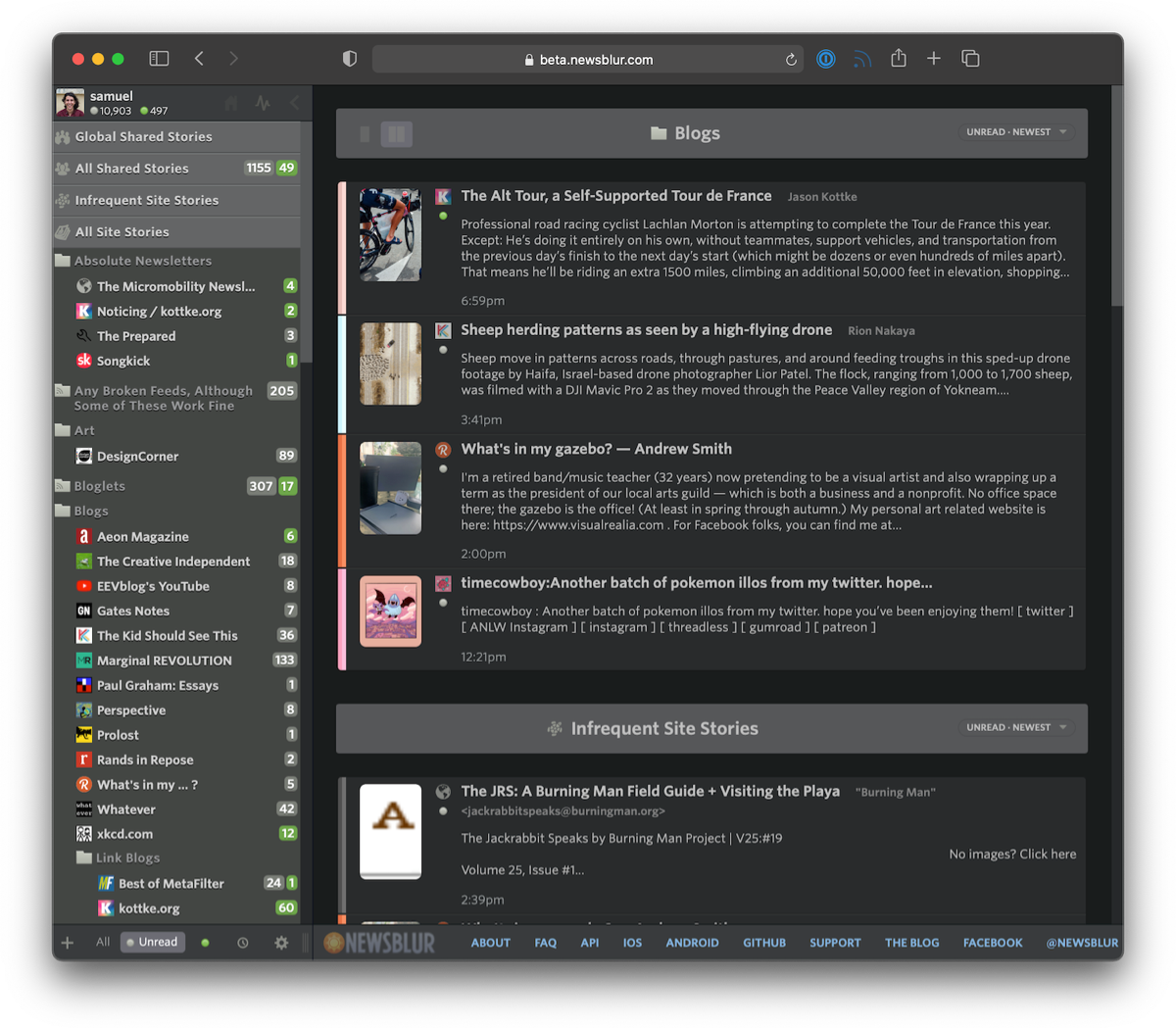
To start, let’s take a look below at the redesigned NewsBlur.

Loads of new features:

  • The dashboard now has multiple, customizable rivers of news
  • Image previews are now customizable by size and layout
  • Story previews are also customizable by length
  • Images are now full bleed on the web (edge-to-edge)
  • Controls have been re-styled and made more accessible
  • Sizes, spaces, and text have all been tweaked for a more legible read
  • Upgraded backend: Python 2 to Python 3, latest Django and libraries, containerized infrastructure
  • Both Android and iOS apps have been updated with the new design

Those multiple rivers come in handy when you want to follow different interests at a glance. You can of course change which individual feeds or folders is loaded, letting you focus on saved searches, infrequent stories, a single feed, or everything you’re subscribed to.

Below you can see the design in action. Notice how easy it is to change where the image preview is located as well as adjust the number of lines of story text to show.

The reading experience itself has also seen improvement. Full bleed images have been ported over from iOS to both Android and the web. This means that images will now run edge-to-edge. And the controls at the top and bottom of the web app have been restyled to be easier to understand at a quick glance.

There’s many ways to adjust story titles to fit. Pack them in dense or offer titles room to breathe.

The redesign has also come to both of the official Android and iOS apps. Right now both are in beta testing, but you can join the iOS TestFlight or the Android beta.

This whole redesign weighs in at a whopping 1,316 commits, which you can view on GitHub. Much of the work that took place here involves upgrading from Python 2 to Python 3 and containerizing everything with Docker. In a few weeks, we’ll post a technical writeup of what those backend changes are and how you can now run a local version of NewsBlur on your own computer with a single line of code. For those that want to run their own private instance of NewsBlur, that line of code is make nb and instructions are found on the repo.

If you’ve enjoyed using NewsBlur and are a fan of this grand redesign, please take a moment to share on social media that you read your news with the help of NewsBlur.

Read the whole story
lukeburrage
1238 days ago
reply
It’s a real pity that edge-to-edge images has come to the web interface! That’s my all-time least favorite design choice of NewsBlur, and the one reason I can’t stand using the app on my iPad. NOT EVERY IMAGE IS INTENDED TO BE VIEWED AT 100% OF THE WIDTH OF THE PAGE. If an image is portrait, I literally can’t see all of it on the iPad app. It’s terrible. And small sized images are expanded out into pixelated messes. Images like webcomics can look terrible, as they are often designed to be surrounded by white space. The iPad Pro should be the BEST way to look at images in NewsBlur, but it is the worst. I hope this update doesn’t bring all those disadvantages to the web view.
wffurr
1237 days ago
File a bug report on the GitHub repo about portrait images. Should be possible to detect aspect ratio in the code and switch the logic for those.
jlvanderzwan
1237 days ago
https://forum.newsblur.com/t/web-beta-story-images-wrong-size-stretched/8828/5
jlvanderzwan
1237 days ago
workaround for now: "I see, you have story titles on the bottom. You’ll want to enable the max-width settings in Manage > Preferences > Stories > Wrap story content at 700px to ease reading."
jlvanderzwan
1237 days ago
Alternatively, use custom CSS: https://forum.newsblur.com/t/web-beta-story-images-wrong-size-stretched/8828/8?u=job_van_der_zwan
Share this story
Delete
3 public comments
koorb
1237 days ago
reply
I do not like the new font.
jlvanderzwan
1237 days ago
reply
If, like me, you don't like the new stretchy images, and you have Stylus or a similar extension that lets you add custom CSS installed, this seems to work:

.NB-feed-story .NB-feed-story-content img {
width: auto !important;
max-width: 100%;
}
rtreborb
1237 days ago
reply
I switched to NewsBlur nine years ago and have haven't looked back. Thanks for all you do, Samuel!
San Antonio, TX

Remy Metailler Smashes Squamish Mountain Bike Trails

1 Comment and 2 Shares

Read the whole story
lukeburrage
1559 days ago
reply
Yup
Share this story
Delete

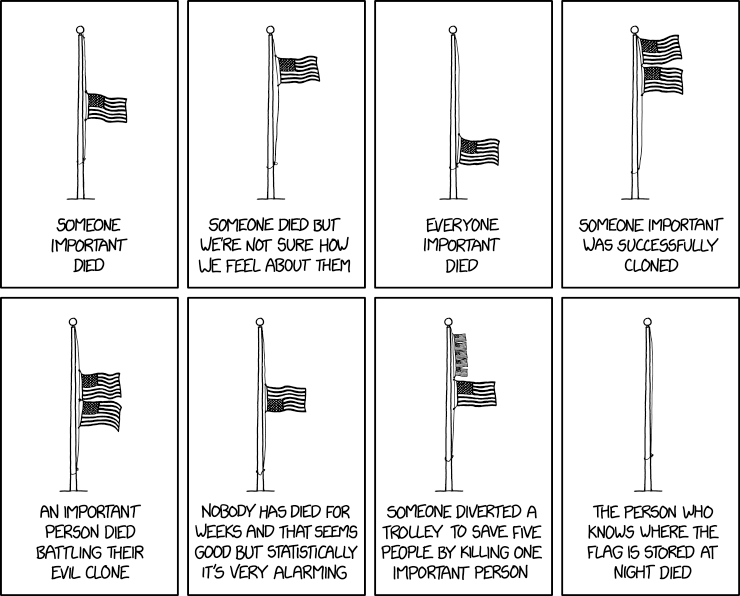
Flag Interpretation

1 Comment and 9 Shares
When Salvador Dalí died, it took months to get all the flagpoles sufficiently melted.
Read the whole story
lukeburrage
1958 days ago
reply
The alt text joke is better than anything in the comic.
marcrichter
1958 days ago
And no alt text bot to tell us all about it!
karmakaze
1958 days ago
"When Salvador Dalí died, it took months to get all the flagpoles sufficiently melted."
davidar
1957 days ago
I wonder how you're supposed to fly a flag when a bot dies.
Share this story
Delete

Baltimore’s new “al fresco” night highlights how pleasant car-free streets are

1 Comment and 2 Shares

A waterfront street in Baltimore, normally reserved for cars, was instead filled with tables and diners for the inaugural Fells Point Al Fresco on June 12. Fells Point is a historic waterfront district lined with a mix of businesses, restaurants, bars, and row homes. Without cars on the street, people were able to walk around freely and enjoy open-air waterfront dining from restaurants on the block.

The rescheduled event (postponed because of thunderstorms) went off without a hitch. Erica Russo, owner of The Point, said that she did not know what to expect with the new concept, but that they were blown away by the response. “We cooked Italian themed food for 125 people, and were sold out by 9 pm. To us, that’s a great turnout.”

Fells Point Al Fresco is the first Wednesday of the month from June through September, and will cycle through different blocks. It’s sponsored by Fells Point Main Street, and each month will have a different theme. The inaugural event featured Italian food.

Misty Keens, Executive Director of Fells Point Main Street, said that the idea behind the themes was to give residents an extra reason to come out. “Even if you have been to these restaurants before, you will still be able to try something new.”

The car-free street proved to be very popular with diners and local businesses alike. Image by Fells Point Main Street used with permission.

Shelby Stephenson, events coordinator of Woody’s, Kooper’s, and Slainte said, “We loved the al fresco event. The Italian theme helped bring new offerings to our regular customers, and the extended outdoor dining brought us new faces.”

Stephenson also pointed out that her restaurants will have the chance to participate next month when the 800 block of Broadway is opened to pedestrians. “We will definitely be participating again next month…Our only regret is that we didn’t put more tables outside!”

Al fresco dining, an Italian phase meaning “in the open air,” is limited in Fells Point to a couple of tables on the sidewalk. While this block has over 60 feet of street width for parking and travel lanes, the 12-foot sidewalk is shared between pedestrians, mobility devices, utility poles, and dining tables.

The loss of parking in front of the restaurant did not concern the participating restaurants. According to Patrick Russell, co-owner of Woody’s Cantina and Koopers, he was more concerned with the weather than with the loss in parking. “The parking was not an issue. As a matter of fact, [the 1700 block of Thames Street] should always be like that.”

Keens agreed. “Parking is an attitude shift. For Fells, we need to see it as people coming down to stay, and not to just pop in.” She pointed out that many of the garages in the area even have cheaper parking than can be found on the street. “However, before we can expand this to Friday or Saturday, we need to show results and do it thoughtfully. If people can’t park, then they will go away.”

Keens did say that there were some issues with traffic flow from the Fells Point offices that will need to be better communicated, and “Also, we need more tables.”

Diners lingered into the evening. Image by Chris Madaio used with permission.

“I commend our retailers and restaurants and Main Street for thinking outside the box and planning events like this to provide something new and fun for residents and visitors alike,” said Brooke Lierman, state delegate for southeast Baltimore and Fells Point resident. She was thrilled to see the success of the outdoor dining.

“Sometimes in Baltimore we get into the habit of thinking that if there is no parking, no one will come, but I just don’t believe that’s true,” Lierman said. “People want to be a part of unique community events, and this car-free evening is just that.“

If you’re interested in checking out other Fells Point Al Fresco events, July 3 will be held on the 800 block of Broadway with an American theme. August 7 will be on the 1600 block of Thames with a Greek theme. September 4 will be on the 700 block of Broadway with a Mexican theme. Keens says, “We are already looking to add an October date.”

Top image: Diners enjoying Al Fresco night in Fells Point. Image by Fells Point Main Street used with permission.

Comment on this article

Read the whole story
lukeburrage
1973 days ago
reply
Or: what every town center in Europe looks like?
Share this story
Delete

Another Slam, Another Pointless Serve Clock

1 Comment

The 25-second serve clock has quickly become a regular feature on the ATP and WTA tours. After a few trials, it made a debut in the run-up to last year’s US Open, and has become broadly accepted since. The US Open and Australian Open both used the countdown timer, and the WTA will employ the devices at 2019 Premier events, with an eye toward the full slate of tournaments in 2020.

As I understand it, the goal of the serve clock is twofold: First, to keep matches shorter by holding players to a standard time limit between points; and second, to enforce that time limit fairly. Tennis and broadcasting execs are always looking for ways to make matches shorter (or, at least, more predictable in length), so the first goal fits in with broader aims. The second is more specific. Many of the players best known for using a long time between points are big stars, and umpires were thought to be reluctant to penalize them. In theory, a standardized serve clock should make enforcement more transparent and ensure fairness.

The success of the second goal is difficult to assess. In one regard, it seems to be working, because we haven’t heard many players complaining about the system. Progress toward the first goal is much easier to judge, and I’ve done so three times: Once after the 2018 Rogers Cup, once after the joint event in Cincinnati, and a third time following the US Open. Each time, the conclusion was clear: The serve clock did not speed up play, and in many cases, it coincided with slower matches.

Count down under

The simplest way to measure the speed of a tennis match is to use the official match time and number of points played, then calculate the number of seconds per point. It’s a crude technique, since the official match time includes time spent playing, pauses between points, changeovers, heat breaks, medical time outs, challenges, and short rain delays. It’s imperfect. But the time spent on changeovers and the like is usually fairly consistent, making comparisons possible.

Here is the average seconds per point for men and women at the 2018 and 2019 Australian Open, reflecting the pace of play both before and after the introduction of the serve clock:

Year  Men Sec/Pt  Women Sec/Pt  
2018        40.2          40.4  
2019        41.0          40.3 

This doesn’t exactly constitute a ringing endorsement of the serve clock. On average, matches were a bit slower in 2019 than in 2018. On the other hand, it’s a better result than the 2018 US Open, which was about 2.5 seconds slower than the 2017 pre-serve clock edition.

More precision, still rather slow

As I said, this is a crude way of measuring match speed. For most tournaments, it’s the best we can do without access to proprietary data that the ATP and WTA (presumably) possess. But at the majors, more detailed information is available. At the US Open, and at the Australian Open until 2017, that was the IBM “Slamtracker” data. The Australian Open no longer works with IBM, but it displays similar point-by-point data on its website.

Armed with better data, we can offer more precise estimates of how often players have exceeded the 25-second limit, both before and after the introduction of the serve clock. (Before the timer, the official limit at slams was 20 seconds, but I don’t think that a single time violation was assessed before at least 25 seconds–or more–had elapsed.) After the US Open last year, I found the number of times that players exceeded 25 seconds increased dramatically, as did the frequency that they went over 30 seconds. If you’re interested, went into more methodological detail in that article.

Again, the Australian Open fares better than its American counterpart, but that doesn’t exactly mean the clock is working, just that it isn’t dramatically slowing things down. Here are some figures from the 2017 and 2019 Australian Opens (I didn’t collect the relevant data last year), showing how often players violated the time limit both before and after the introduction of the timer:

Time Between   2017   2019  Change (%)  
under 20s     77.6%  75.9%       -2.2%  
under 25s     91.6%  91.8%        0.2%  
over 25s       8.4%   8.2%       -1.7%  
over 30s       2.8%   2.1%      -25.2%

The last row of this table is the first point I’ve seen that indicates the serve clock is working. Players are exceeding 30 seconds between points far less often than they did two years ago. On the other hand, there’s almost no difference in how often they cross the 25-second mark. And another negative: The “improved” figure of 2.1% of points over 30 seconds is considerably worse than the same rate in New York last year, which was a mere 0.8%. The clock has eliminated some of the most egregious offenses in Melbourne, but a lot more remain.

Carpenters, not tools

The main problem continues to be the way the serve clock is used. The countdown begins when the score is called, and umpires generally wait until crowd noise has subsided before making their announcement. Thus, after exciting shots or long rallies–the very points after which players have historically taken a long time to serve–the time limit is effectively extended. There’s simply no reason for this. Start the timer when the point is over, and if the crowd is still going wild 20 or 25 seconds later, make the appropriate adjustments. But many servers are already playing “to” the serve clock, using all the time they are allotted. The longer the umpire waits to start the clock, the longer all of us must wait until play resumes.

My primary complaint with delayed clock-starting, though, is a different one. Yes, I’d like matches to move along faster. But as with just about every line in the rulebook, the time limit ends up being extended for stars more than it is for journeymen. On a stadium court like Rod Laver Arena, a modest ovation follows nearly every point played, especially those won by a big name like Federer, Nadal, or Serena. Out on Court 20, Johanna Larsson can play a bruising rally and earn nothing more than a polite golf clap. The more anonymous the player, the less recovery time. After a couple of matches, that adds up. A rule designed to increase fairness and transparency shouldn’t work against unknowns, but in this case, at majors, it appears to do just that.

Eventually, I may stop writing about the serve clock. But as long as the tours are pushing an innovation that fails to meet its stated goals, I’ll keep auditing the results. Given a few more years, maybe they’ll get it right.
Read the whole story
lukeburrage
2120 days ago
reply
Serve clock to speed up play slows it down shocker
Share this story
Delete

Phones without headphone jacks suck

2 Comments and 3 Shares

Techcrunch's Greg Kumparak started agitating for phones to have standard 3.5mm jacks in the 2000s, rejoicing when the original Iphone shipped with one; now, two years after Apple took away the phone jack (and after most of the major phone manufacturers followed suit), he's still lamenting the loss: my original Pixel finally died (I can no longer find charging cases to make up for its limping battery) and I've ordered a Pixel Three and the stupid dongle that lets you charge your phone while plugging in standard headphones -- it hasn't arrived yet and I already hate it. As a heavy traveler who is very reliant on a phone for translation, itinerary management, mobile hotspot, etc, the last thing I needed was another dongle to manage, another device-class to charge, another charger to carry, and another hard-to-source component to lose or break while I'm between cities. (Image: Bribass)

Read the whole story
lukeburrage
2155 days ago
reply
Does Cory Doctorow like anything anymore? Or are only complaining blog posts shared on NewsBlur?
Share this story
Delete
1 public comment
jhamill
2155 days ago
reply
Does Cory Doctorow know that there are other Android phones that have a headphone jack? It's not like there's only 2 phones (iPhone & Pixel) in the world.
California
tingham
2155 days ago
Any sufficiently complex software application will eventually become a slow, bug ridden, half-implemented version of "angry dude on the internet." ;)
jhamill
2155 days ago
It seems that many of the people who were "thought leaders" at the beginning of the rise of the internet have delved into "angry dude on the internet" because things have changed. Like they can't handle that people have different opinions on what the normal should be.
tingham
2155 days ago
Indeed.
rocketo
2154 days ago
This of all the hills to die on
Next Page of Stories